THE ARLOLANGHAM SIMPLE-SIG SHOWCASE

ARLO

On A Break From Sig Requests
Hello again, Wrestlezone!
Recently my influx of sig requests has slowed down considerably, which sucks. However I often make miscellaneous sigs for fun.


So this is where I will display them. I hope this will make people want one for themselves.
I will upload a few every couple of days, or sooner if I make one that I'm particularly proud of. If I get consent, I will also show ones people have requested from me. I may also upload and make Iphone wallpapers, and you can also request your own from the Simple-Sig request thread.

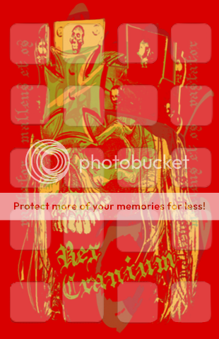
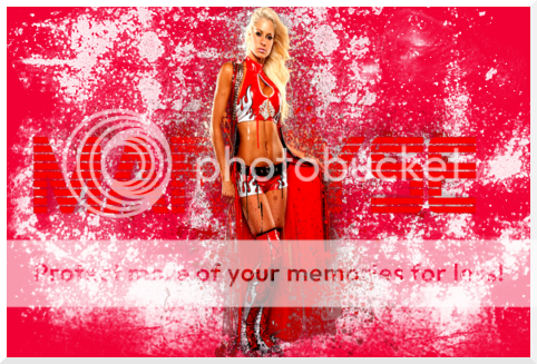
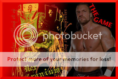
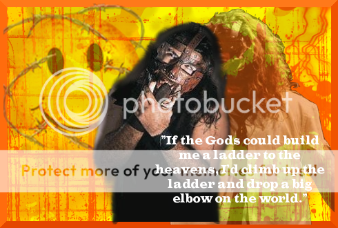
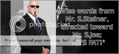
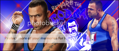
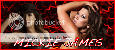
I'd also like to quickly explain my style. I have dubbed my sigs "Simple-Sigs". I mostly use very simple programs such as Preview, Iphoto & paintbrush. They are a break from the norm. I usually have a solid background with one or two photos and big text. They have earned some pretty positive feedback from those who have requested one.

So, if you like what you see here in my showcase, or just like having multiple sigs in your arsenal, I urge you to check out my request thread. At least take a minute to try me out, as I only do this for fun. It doesn't take much effort to ask for one. My request thread can be found in the requests section or at this link:
http://forums.wrestlezone.com/showthread.php?p=2736329#post2736329
Thanks everybody!​
 
OK everyone, here's your first taste. These are a few I've made recently with the effect of them sorta standing on a block of colour. I'm sure there is a much more technical term for it though. I like the simplicity of this style.

KOFIKINGSTON.jpg


KINGSHEAMUS.jpg


Y2J2.jpg


MCMG.jpg


I'm pretty happy with this bunch, with the exception of the Sheamus one. It didn't work as well as I thought it would.
 
I'm not a great sig maker, and any sig you make would be better then mine, I'm also not an expert on sigs either, so don't take my review on them to seriously. These are, pretty bland sigs, but I'm guessing that is what you we're going for?

The Kofi Kingston one is simple, but a little too bland. The logo and cut out was good, but the blue banner takes away from Kofi's color scheme, and the font style is boring and out of place.

The Sheamus one is a lot better, but the light green banner should have been darker, to match the font. The Sheamus logo on the white background looks messy and distracting, and should also be fixed.

The Jericho one isn't bad, the colors all match well. Only problem is, the cut out you used looks just a tiny bit rough around the edges, and could give off an unprofessional vibe.

The last one is probably the best, with the colors and the cut outs for the characters. Although, I would make the font in the banner black, to match their attire. I would also add a logo on the right side, to avoid too much white space.

Although this isn't in your showcase, your current Cm Punk sig is really good. The black and yellow colors form well with his Nexus theme (obviously what you were aiming at), and the choice of picture, where Punks arm goes right beneath the font, is a cool addition to the sig. There is only one tiny little problem, and it's highly unnoticeable.

You have Punk of a light shading, like the translucent type of effect, over the yellow banner. If you look closely, you can see the edge of the banner through Punk's shirt. This could look unprofessional.

All and all, your sigs aren't bad. I would suggest avoiding the white backgrounds though, I know you are aiming towards the simple theme, but they are a little too simple for graphics. Also, try to focus on the matching of colors, and see what matches with pictures, attires, logos, etc. That could really help get you jump started.

Good Luck.
 
Sully, I can understand the bland thing. It's sorta a matter of which way you look at it and you're right, I am taking the simple route.
I'm not aiming for "unprofessional", but the good thing about them is that they're not world class Angelic Diablo or Theo. they're meant to be different.

And that edge thing on the CM Punk one has been troubling me a lot.

Thanks for the constructive criticism.
 
If you made Cm Punk less translucent, it would be fixed. Although from my experience with graphic making, I'm not sure if you can fix that after you already moved on to another step.

I only used Gimp, never Photoshop.
 
OK everybody, I just had to upload and show this one off. Here it is:


GIMPJEFFARDY.png


This sig marks my first successful GIMP signature. It is also my fave sig I've ever made.

basically I just followed TPP's GIMP tutorial (Which was a HUGE help), but with my own brushes and renders. I started with a violet-ish background and went to work with some purple brushes. The pictures sort of give it a trippy look, which the subject of the sig knows all about (I kid, I kid, I love Jeff Hardy). I topped it off with red text and border.

I'm personally really proud of this, and I'd love some feedback/tips. In the coming days I'm gunna make some similar ones but with different people.

Thank you everybody :)
 
OK I know I'm throwing sigs out pretty quick, but I figure the more I show, the higher this will stay on the list, the more people decide to check it out.

I'm just getting good at GIMP so here a few that I've made.


GIMPHBK1.png

I sampled the gold off the back logo for the background, and added heaps of orange lightning.
then I added the three pics and lowered their opacity.
Having the text and border the same colour works nicely here.


tripleh-1.png

My first Iphone wallpaper.
triple H's new logo on a red background.
I made a template of where the icons go and brought it's opacity down. All the icons should fit nicely.


GIMPMARYSE.png

Not too happy with this. Didn't turn out as good as it looked in my head.
The writing and some of the white stuff is actually part of the render I got off psd-dreams.com (awesome site, ch-check it out).
It's actually been down all day, if someone knows why, please tell me.


GIMPEDGE2.png

This was a real quicky. Literally 1 minute.
All i did was paste the render on a red background, but it still looks sick.


GIMPTRIPLEH.png

Last but definitly not least. In fact, it's probs the best of the bunch. My favourite, at least.
A red-to-black background with the logo over the red and Hunter over the black.
I was considering an all red background, But Triple H would have looked very out-of-place.
I've got the red writing running down his neck and a big red border. I love this one.


Please offer feedback and tips. If you want one of these or just wanna put a dibs on it, simply be the first to PM me.
But not the HHH one. that's mine.
Oh and take the phone wallpaper if you want it.

Well, to all who see these, you've witnessed my evolution from, let's face it, pretty shit Simple-Sigs to pretty good, yet still simple ones.
I thank you for your time.

Be sure to request your own Simple-Sig.
 
Hi everybody. I'm so into my sigs at the moment that I'm probs gunna be uploading a few each day.

These are more of me just messing 'round on GIMP. I've really only used the basics so far.


MANKIND.png


Everything Mick Foley has ever done is magic, which puts him in my top 5 favourites of all time. Started with a warm yellow background and added bar-like orange bits. Then added his TNA logo and a pic, which i turned the opacity right down on. Then I placed a cool render on top and smudged it in a downward direction, which adds cool effect. I found a nice quote and stuck that on there as well. I only now realize that I've covered up Mr. Socko. Perhaps I should make an all Socko sig?


CORRE.png

This is just a super quick Corre one. Not much to say about really.


RVD.png

This RVD one turned out real nice. I sampled the green off the attire of the render, which you can't see. There was also blue so I made that my border. The renders are my own cuts, coz psd-dreams' server is down or some bullshit.


GONEBUTNOTFORGOTTEN.png

Was just looking through my folder of renders and realized I had B&W pics of 3 of the best musicians of all time. It also helps that they're all dead. In case you don't know, It's 2Pac on the left, Kurt Cobain in the middle & Bob Marley on the right. I've given them the effect that they're fading into the stars, which fits perfectly.


GIMPSANTINO.png

Another quicky, I really just made this to show everyone my dream. Santino for WWE Champ!


MYLOGO.png

This is actually a little logo I made for myself. It's the Dodgers' logo flipped so instead of LA, it's AL ( my initials). I'd like some feedback on this one, guys.


Well there you go. As usual, please give me feedback. If you are a fellow sig artist, or at least no your shit and you see this, just put down a small comment or tip, it's not that hard. Also, request your own. Again, it's not a tall ask.

'Til next time.
 
Back again!
Here's a fresh batch. I think some of my best sigs are here.
I've been making ones of a smaller size than normal. I usually use 470X310, but I've taken to making 400X200 ones (excluding borders). Let's check 'em out.


THEROCK.png


Here's one I'm really proud of. All I did was sample a light and dark blue from my render and made a cloudy background with them. Then it was just a matter of putting the pic on and editing it 'til it was roughly the same as the background. The white and blue borders cap it off nicely.


JEFF2.png


basically what you see is what you get with this one. Fluro green background with pink splodges, blurred edges on the render then some brushwork over the top that blends nicely.


JOMO1.png


OK OK, this one can be a bit of an assault on the eyes but I like it nonetheless. First a purple background and bright splodges, then his logo with a very low opacity. Then a render with some effect whose name I cant remember. The another one, which had the text on it, which I added the burn effect to. I then did more colourful brushwork over that. Then a pic which I just blurred the edges on. Thick purple border with a thin black one.


RATEDR.png


Very very straightforward one here. red BG, faded pics and one solid pic. Some text caps it off. just a thin black border.


HBKGIMP.png


Here's one I knocked up for someone requesting this. They wanted the HoF logo and that text, and I really just took care of the BG and a pic. Not overly happy with this.


There you have it. As, you might see, the Rock one is my current sig. I love it. I'd really only add the JoMo and Edge ones to my arsenal other than that.

Please give me some feedback guys. And request your own at my request thread. It's really slowed down recently. It doesn't matter if you don't use it, at least just ask for one.

Thanks everybody :)
 
I'M BACK!
And hopefully better than ever. I haven't posted like all week but that's coz it's my first week back at school after summer holidays.
There's a much bigger workload in year 10 compared to year 9. I'm also taking a semester of Digital art this year, which should help my sig making. Prior to now the only training I've had is a semester of year 9 Computer Aided Design (which I almost failed coz I mucked around heaps in and finished all the work in the last class) and a LOT of research via the internet.

I also spent a lot of time downloading renders off PSD-DREAMS. I reckon I've got at least 50% of their stuff saved on my Macbook.

I'm going to start ordering the sigs in each batch in least favourite - to most favourite in a countdown-esque manner. So without further ado, here's some sigs I've made this past week:


5: KAVAL
WARRIOR.png

THOUGHTS: just coz this comes in at 5 doesn't mean I don't like it. The middle pic is of him in his orange attire but the others are blue. I did my best to get them orange-ish and to blend in.


4: PHIL DAVIS
MrWonderful.png

THOUGHTS: Mr. Wonderful is one of my favourite current fighters. I consider him the Chris Jericho of UFC; the perfect blend of cocky swagger and ability. As far as the making of the sig, it's just the pink sampled off his trunks with some white dots (they look like stars, and Davis is a star). Then white text with a black stroke and a thin black border.


3: AJ STYLES
TNAsSaviour.png

THOUGHTS: I was just inspired to make this after AJ's recent face turn. He is reprising his role as TNA's Saviour again. I'd personally like Robert Roode to have this position. but any-who, that's where this one comes from. In case you can't tell, on the left he's doing the spiral tap and the springboard superman punch .I know that's not it's name, but Josh Matthews called Kofi's version that and I dug it.


2: CHRISTIAN
CHRISTIAN1.png

THOUGHTS: K.I.S.S. - Keep It Simple Stupid. That's the philosophy. This is just three pics made white and yellow and his logo. A black border makes it stick out. Love it.


1: RANDY ORTON
RKO.png

THOUGHTS: THIS IS FUCKIN' SICK! If I do say so myself.
I love this. Green BG with black brushwork. 2 logos rotated about 45 degrees and blending in then a simply awesome render of him in viper mode. Then the pretty famous pick of him with a snake body. I chose to omit most of the body as the green shade would clash with my BG. Then some simple text with a red stroke sampled off the right-hand-side logo and a black fuzzy border.


There we are everybody. I urge you to leave feedback and check out my request thread. I just posted on it with the intention on moving it up the list. I haven't had a request in so long and it's really frustrating. Please at least test me out, it takes zero effort out of your life.

Bye everyone :)
 
OK everybody my Macbook's going in the shop tomorrow and I'm not sure how long I'll be without it so here are some new sigs. No countdown order today, can't be fucked.

TBP.png

Ah the original Beautiful People. They have captivated me for so long. It's only fitting I made a sig about them.

MIZ.png

This is really just an excuse to use the "Miz Is The Future" logo. It turned out really nice.

MICKIE.png

I'm pretty annoyed that the foreground pic covers so much of the other one but I really wanted the text to be sitting on her ass. Dissappointed with this, I may re-do it soon.

McINTYRE.png

Simple little Drew one. As you can tell I've been experimenting with adding borders to individual pics.

MADISON.png

I really wanted a Madison sig to accompany her queen gimmick. I know it's not a pic of her with brown hair, but she's so fuckin hot in this one :p

BIGSHOW.png

Nothing to say about this. what you see is what you get. My first ever Big Show sig.

BOOKERSBACK.png

I have always loved Booker and he's return to the WWE was begging for a sig. The text may seem silly but it's something I can picture him saying.


OK people, there's your most recent bunch of Simple-Sigs to view. Somebody please leave me some feedback.

Last but not least I wanna give a big shoutout to a great new sig-maker, StraightEdgedSoldier. He's looking to get his name out so please check his showcase:
http://forums.wrestlezone.com/showthread.php?t=151922

And request thread:
http://forums.wrestlezone.com/showthread.php?t=151736

And of course my request thread as well. See ya guys :)
 
Thanks for the plug there, man. ;) Just thought I'd critique your new trial effect. I like the idea of putting borders on individual renders, but I think, for looks sake, you should decrease the size of said borders in some of them. Like, the size in the Booker one is perfectly acceptable, but the size in the Drew one is almost distracting. Overall though, their looking good!
 
Did you miss me?

I'm sure some of you didn't, I reckon my style's earned me a lot of haters. But I don't give a fuck, haters gonna hate. In fact, haters motivate me just as much as fans, coz I know the more I post, the more annoyed they get:lmao:

Anyway, this should be a big batch with some great and not so great sigs. I choose to show you my bad ones to prove that all siggers make the occasional shit one. So, without further ado, here are some new sigs.


MoizH28
MoizH28-1.png


THOUGHTS: I really like this one that was requested of me. Maybe it's because of the overload of babes. I started with a pink background and the made a new layer where I did some brushwork in white. Then it was just a matter of arranging the PSDs and adding text.


BRING BACK THE BIRD!
SWAGGERSOARINGEAGLE.png

THOUGHTS: wow, really simplistic. Yellow BG, yellow text with black stroke and the pic. I added a cartoon effect to the pic. Not the greatest sig in the world.


SCSA
STONECOLD-1.png

THOUGHTS: again, really simple. The only thing that you mightn't be able to tell just by looking at it is that there's a thin green border round the pic.


MR. ANDERSON
MRANDERSON.png

THOUGHTS: Another personal fave. I'm seriously considering wearing this. The image on the right just has a multiply mode on it, and on the main pic I upped the contrast and cartooned it a bit.


LITA
LITA.png

THOUGHTS: It's about time I made a Lita sig. Again, you can tell what's goin' on just by looking at it. Another kinda boring one.


EZEKIEL JACKSON
EZEKIELJACKSON.png

THOUGHTS: I love how this turned out. Orange>black gradient, orange text, black stroke, black border. Nice and simple, but very effective.


CM PUNK
CMPUNK-2.png

THOUGHTS: My current sig. Having borders around the pics here really make them hit you. I added a white fuzzy border, which makes it look cool while wearing it as it blends in.


There you have it. I s'pose they're not real ARLOLANGHAM Simple-Sigs anymore, just ARLO Simple-Sigs. I figured I'd change my name as I racked up 50 posts and as many of you figured out Arlo is my first name.

Please leave me some feedback/tips and put in an order for your own Simple-Sig over at my request thread.

Catchya later :)
 
OK everyone, here is my latest offering. I think I put more time & effort into these 3 than I have on any others. All 3 turned out really nice.


ATTITUDE ERA VS. PG ERA

ATTITUDEVSPG.png


THOUGHTS: I was so inspired after The Rock ripped on Cena last week to make this.
I found 2 perfect pics; one of Rocky mocking Cena and the other of Cena looking like he's gonna burst into tears.
I started with a black BG and then used a big red brush that I found which can cover entire layers and gives it good effects. Then I added the two main pics and gave them feathered borders.
Then came the logos which have 50% opacity and text. A thick black border caps it off.


ANTICHRIST

ANTICHRIST-1.png


THOUGHTS:
This time a purple BG and red brush from the same series as the last sig.
Again, 2 pics with feathered borders and one's had it's opacity lowered. Text and a border seals the deal.


ROCK IS HOME

ROCKISHOME.png


THOUGHTS:My crown jewel. I wasn't going to make a sig about the great one's return but 2 people have requested them from me so i was inspired.
No offense to them, but I saved the best for myself:lmao:. Blue BG, big black brush and then some wavy blue brushes.
Added a nice render, upped the contrast and added the feathered border. I did the same to my logo and text.
I believe I added a multiply mode to the logo. A blue border seals it. I really think this could be my best sig ever.


There you go guys. Please, if you're a fellow sigger at least put a few comments down, I'd love some tips.

C YA!
 
I like the Rock one, but I think I would only suggest one thing...Get that nasty looking red color out of Rocky's name thing. It just looks gross. Aside from that, good work! :)
 
Hey Arlo, I got your PM and I finally have some spare time to give some insight. So I'll just pick some sigs at random and critique.

MoizH28-1.png


-I really like this one. It is simple, which is your motto, and everything flows nicely. The pink background, the font, the stars, and the girls all flow to make a really nice sig. Sometimes simple is best. No real problems here and nothing I wouldn't change. I'd say it is definitely in the 8 range on the 10 point scale.

CMPUNK-2.png


-This one is easily my favorite of yours. I love the fuzzy border and the Punk logo instead of an actual font. Excellent choices in terms of photos for Punk. Only issue I have is the back stroke on the background image. I'd personally wouldn't have done it, but it doesn't take away from the quality of the sig. Definitely a high 8, close to the 9's on the 10 point scale.

GIMPMARYSE.png


-Again I like this one despite you not liking it much. Font is shaky, but it blends into the spongy background nicely. It is simple yet has a sort of complicated feel to it. I think it would look really nice as a wallpaper for a computer if it was larger. Mid 8 on the 10 point scale.

ROCKISHOME.png


-A bit going on in this one, but it looks like you are experimenting with adding more backgrounds than an image and a solid color, so that is definitely a good thing. Definitely your best in terms of experimenting. Not a fan of the color as the blue is really bold and can be a bit harsh on the eyes. Maybe a darker blue to work with the black would be better. High 7's, low 8's on the 10 point scale.
 

-This one is deff. in my opinion, your best sig. No doubt about it.
Love how you faded out the edges, and that whole effect around the sig without adding the border.
The color, and text placement was perfect.
and The Render was great.

Maybe you shouldnt have added a stroke around the renders of Punk, and added a drop shadow.

Easily the best sig you have done.
Good Luck, and keep on improving man!
 
Thanks so much AD & Theo. My original thanking posts got taken down. I'm not sure how they were spam, this is my thread and I said why I was thanking them. Mods mustn't have seen how important their feedback was:disappointed:
Anyways, it's been a while but here are a few sigs.


ATREYU
ATREYU4.png

THOUGHTS:I made this for a guy named Atreyu. I realized he pinched a quote off one of my works, so instead of him just having the writing, I made him this sig. It's just the pic, the text and some barbed wire brushes in B&W.


MIRKO CRO COP
CROCOP.png

THOUGHTS:one of my favourite fighters and definitely my fave heavyweight. A red and purple BG and then a brush behind the image. Simple text and a border caps it off.


SAMOA JOE
SAMOAJOE-1.png

THOUGHTS:My favourite from this batch. black and green BG and then 2 pics and a logo. I believe the back image has a mode on it which blends it into the BG.


RETURN OF THE KING
RETURNOFTHEKING.png

THOUGHTS:Can't believe Rocky's return overshadowed the Game and Taker's by so far in terms of tribute sigs. I had to make one.


D'ANGELO DINERO
POPE-1.png

THOUGHTS:I thought I'd make a quick pope one. I hate how underutilized he is. I added the same type of border as my CM Punk one, which recieved good reviews.


JOMO
JOMO2.png

THOUGHTS:I was just messing around doing this. It's a bit assaulting to the eyes, eh:lol:


Okie Dokie, that's it for now. Please leave feedback/tips/REP:)p)​
 
Hello everyone. It's been a few days since I showed off some sigs. I'm proud of the fact that I can pop out good sigs in a short amount of time, so I'll be bumping this thread as much as possible. On a separate note, tomorrow's my birthday. Happy birthday me :p
Anyway, here are some of my most recent works.


GOLDUST
GOLDUST.png

THOUGHTS: This was, believe it or not my first time using a gradient map. Looking back, I can't believe how long I went without using one.


MR. STEINER
STEINER.png

THOUGHTS: I've actually been envisaging this for a while. It turned out just how I wanted it.


NEXUS
NEXUS.png

THOUGHTS: I believe this is my first sig with the entire nexus on it. Black BG with some yellow brushes. Then the logo and the pics. Every pic has a slight blackness to it, which was done via gradient map. I wish I hadn't made it so big to start, coz I realized when the time came that I couldn't fit a border :blush:


TRIPLE H
TRIPLEH-3.png

THOUGHTS: I found the game's new logo and PSD-dreams and I had to use it. I also experimented with the canvas effect. It doesn't look too good here, but in the last sig (SEE BELOW) it works to perfection.


RANDY ORTON
RANDYORTON-1.png

THOUGHTS: Nothing to say about this. It's one of those sigs that's neither here nor there. It's a Randy Orton sig, nothing more.


RATEDROCKSTAR
RATEDROCKSTAR5.png

THOUGHTS: Made for a guy named ratedrockstar. He always gives me good requests, but living in Australia, I don't know much about indy mainstays such as Roderick Strong. I am however, very happy with this. It's a black BG with red/white 'mask' brushes. The 2nd pic has a canvas effect. Turned out pretty good.


KATY PERRY
KATYPERRY.png

THOUGHTS: The creme de la creme. I have a lot of celebrity crushes, but Katy is number one. The back pic has a canvas effect and some mode (I forget the name). I put some pink brushes behind it so it still stuck out.
I seriously think this is one of my best sigs EVER!


Well there you go. All feedback, tips, abuse is welcome.
I love to hear feedback, but for some reason I don't get a lot of it. I'm sure people see my sigs and have an opinion on them, they just never write it down. Please, do write it down, even if it's just a sentence or two.

Bye everybody.​
 
Wow, I think this is the longest I've gone without flashing some sigs for you guys. My request thread was booming for a while, especially with AD's hiatus, but now it's gotten a bit quieter. Please request something, guys.

I'm really interested in branching out from sigs, so if anyone needs an official gfx man for their book this etc., PM me. I'm also going to start doing posters, as they're great fun.

But anyway, here's a fresh batch of signatures:


SHANNON MOORE
SHANNONMOORE-1.png

THOUGHTS: I've really been experimenting with adding grids over individual pics recently, as displayed by the left hand render in this sig. I rather like the way the orange BG works with Shannon here.


MATT HARDY
MATTHARDY.png

THOUGHTS: Possibly my fave from this bunch. Grid effects on both pics of Matt. There was heaps of dead space so I added the logo.


JEFF HARDY
JEFFHARDY.png

THOUGHTS: by now I'm sure you've realized a pattern. I can't explain why I've done 2 pics and a logo on these first ones. It works pretty well. I like the darkness of this one.


STING
STING2.png

THOUGHTS: I really just whipped this up after Sting's return. Nothing more to say about it.


E&C
EC.png

THOUGHTS: We all want it, so make it happen, WWE. One of the best tag teams ever. I've been wanting a reunion since they were both faces on SD! last year. Christian's injury stopped it, but surely it's just a matter of time now.


OK guys, there you go. PLEASE LEAVE SOME FEEDBACK!​
 
Hey everybody. Got some new sigs, but before I start, I'd like to urge you to request a sig from me. My request thread is going through a real dry patch.
Also, if anyone is interested in me restarting Sig of the Week, PM me. I'm sharing some of the responsibility for it.
But now, some sigs:


CODY RHODES
CODYRHODES2.png

THOUGHTS: I was super impressed by Cody's promo on the last SD! and he reminded me of Mankind (not just coz of the mask). I found a sick image, gave it a black gradient map and grid effect then lowered opacity.


SNOOP DOGG
SNOOPDOGG.png

THOUGHTS: One of the best rappers of all time. I found a nice smoky stock image which I put on a black BG. Then added the grid and a feathered border to my image and some text.


EVAN BOURNE
EVANBOURNE-1.png

THOUGHTS: So glad this guy's back. I hope they let him have some matches with Mystico when he debuts as Sin Cara. I'm gonna quickly promote a set of brushes I found long ago which are 500x500, so they are perfect for WZ sigs. They add a real nice texture and I use them all the time. This one has an orange BG and a purple one of said brushes. Then I added an image of the SSP and filled it white. I then added a border, copied, and rotated twice on two new layers. Text and another pic finishes it off. My favourite from this batch.


BROCK LESNAR
BROCKLESNAR.png

THOUGHTS: Not much to say here. The back image has a red gradient map and grid. I believe I darkened the right hand side image.


And there you have it. Once again please request something from me. It doesn't take much effort and I'm not forcing you to wear it.
Also PLEASE leave me some feedback! I need tips etc to get better.

Bye guys.​
 
I really like that Cody Rhodes sig, and not just because I like Cody Rhodes. You use space well, the colors fit, and it's well put-together. It is as you say simple, but very effective. Good work.
 
Back once more. Thanks for the comments Doc. Oh and keep requesting guys, hopefully I'll get some more work while Theo takes a well-deserved break.


AJ STYLES
AJSTYLES2.png

THOUGHTS: I was inspired by the silhouetted SSP on my Bourne one, so I tried a similar thing here.
I can't say I like it as much as the Evan Bourne one, but I do like the way the text hits your eyes.


SCSA
SCSA2.png

THOUGHTS: To tell you the truth, I only made this coz someone uploaded Austin's new logo to PSDdreams.
It turned out so good, however, that I've been wearing it since I made it.


ARSENAL FC
ARSENAL.png

THOUGHTS: My favourite soccer team. I started with a nice C4D as a BG then added and edited their logo.
Then I added a pic of captain Cesc Fabregas and put a layer mode on it.


CM PUNK
CMPUNK2.png

THOUGHTS: Probably my fave guy to make sigs of.
There is a never ending supply of renders and logos. This is really simple.
Red and black brushes, logo and render. Capped off with text.


DREW MCINTYRE
DREWMCINTYRE.png

THOUGHTS: I was itching to use the middle image, being of Scottish heritage myself.
I hope WWE doesn't fire McIntyre, as he's a good worker. I think a move to RAW would help him a lot.
As far as the sig goes, it's just said image and a logo on a mode.
Then another nice render and some text.


SANTINO MARELLA
SANTINO.png

THOUGHTS: Only my second ever Santino sig, I believe.
Blue BG, red/black/white star brushes.
The logo and RHS pic have blue gradient maps on with lowered opacity.
Capped off with a cobra image. Gotta love the cobra!


SHEAMUS
SHEAMUS.png

THOUGHTS: Another guy I've been meaning to make one of. I guess my inspiration went away when he started losing every week.
Nothing much else to say about this one.


CHRIS JERICHO
CHRISJERICHO2.png

THOUGHTS: REALLY proud of this. This is my first sig where instead of a shit load of brushes, I've just used stocks, filters and adjustment layers.
Started with a blue bg and then added the grid-like stock.
Made that blue, added some effect (I forget which) for the lines around the edges and made the border of his old Y2J pose.
I then added the image and made three duplicates. On said duplicates I added a lens flare and motion blurs.
I put the blur layers behind the original and the flare on top. Then I added text and gave it a darker blue stroke.
Then I made two more motion blur layers and put them behind the text.
A thin black border caps off one of my best sigs EVER!


WOW! big collection here. Everything is up for grabs (except the Y2J one ;) ), just shoot me PM if you want to wear any of my work.
Also guys, please follow Doc's lead and leave a short comment, it really helps. And request your own.
Bye for now.​
 
I'm not sure why, but I made a shitload of women wrestler sigs yesterday. A few turned out really good, some not. So, without further ado, here is my
Divas & Knockouts Spectacular!


NATALYA

NATALYA.png

THOUGHTS: One of the not so good ones. It's not shit, but it's a bit bland.
It's basically a pink bg with a stock. I duplicated the stock and filled one black and one white.
Big blocky text because, let's face it, Natalya is big and blocky.


MICKIE JAMES
MICKIEJAMES2.png

THOUGHTS: Not happy with this either.
It's just a lava pattern on a black BG. The LHS pic has a black gradient map.


MARYSE
MARYSE2.png

THOUGHTS: Oh yeah, love this one.
Red bg, pink stock. Two background pics with low opacity and gradient maps.
the front one has motion blurs going either way (a technique I've been using a lot) and a gradient flare.
I capped it off with text and the same style border as my CM Punk one which received good reviews.


MADISON RAYNE
MADISONRAYNE2.png

THOUGHTS: Really basic. The red bit is just a brush.
I wanted to incorporate the nice new Madison pic and I wanted a sig of her queen gimmick.
My only regret is the red border. It looks good but makes the render look cut-off.


EVE TORRES
EVE.png

THOUGHTS: I saw an article in an old WWE magazine article (I think it was about healthy fruits or some shit) that used this colour scheme.
I thought I'd give it a go. By this point I'd figured out that I was gonna do this special so I was just looking for someone to make one out of. Not too happy with this.


LAYCOOL
LAYCOOL.png

THOUGHTS: Probably my second favourite. It's a red bg with purple brushes.
I used those 2 colours to gradient map the outside images. No alterations to the middle pics.
It's finished with text, a thin purple border and then a thin black one.


KAITLYN
KAITLYN.png

THOUGHTS: Definitely my fave. One of the hottest divas going around.
It would take me too long to explain what I did, there were like 25 layers by the end.
Just take it in and enjoy ;)


There you have it guys and girls. My first ever special edition. It was great fun and I think I'll be doing more in the future.

Oh and a special shoutout to Ace Sleeper, a guy looking to get a request thread going. I received what he claimed was only his 3rd sig ever, and it was pretty damn good. Here's a link: http://forums.wrestlezone.com/showthread.php?t=158359

If you'd like to use one of these, simply send me a PM making you're intentions known.
Also, if you're a fan of mine and you need to spread some rep around, I'd be happy to take it off you're hands. And request you're own.

That's all from me for now guys. Tune back in soon for more ARLO sigs.​
 
Overall I think you've got a decent collection here, but my main criticism throughout them all is that your type work needs, well, work.

I feel the strokes on all the textual elements are far too heavy or 'blocky' so I'd work on maybe blending your typography into the background a bit or perhaps softening the edges slightly. It seems you've started to do this on the "Kaitlyn" piece and this looks cool.
 

Users who are viewing this thread

Members online

No members online now.

Forum statistics

Threads
174,826
Messages
3,300,733
Members
21,726
Latest member
chrisxenforo
Back
Top