
Damn It's been a while!
No announcements or anything, straight into sigs.
WINNING & LOSING
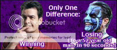
THOUGHTS: Made this after the atrocious Victory Road ending. Charlie Sheen's winning had been the shit for the last week and these 2 are spitting images of each other. There's nothing special about the sig itself.
HURRICANE
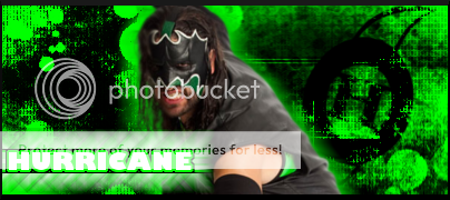
THOUGHTS: Been experimenting with cinematic borders. This one came off alright. To tell you the truth, I don't like this one. It's just... boring.
POPE
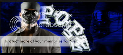
THOUGHTS: I've been trying to make a good Pope sig for AGES. I think I've finally pulled one off. Blue and black bg and then the rhs image. I gave it a black and blue gradient map and just left it at that. Then I added the lines on a new layer, and added his logo on top. Another new technique I've been using is making a gradient map of a pic and moving it below the original pic. Then I'd duplicate it and give each of them a motion blur in opposite directions. I'd then blur the edges of the original image. That's what I did here.
AJ STYLES
THOUGHTS: Another AJ sig. Defs one of my fave wrestlers of all time. His DVD recently got re-released over here so I bought it and was inspired. I like this sig, it hits your eyes nicely.
NBA RKO

THOUGHTS: This idea just hit me so I had to make it. Started with a blue BG then rounded the corners. I then added the image on a new layer and filled it white. Then on the bottom layer I simply selected roughly down the middle of the image and filled it red. Then I did a few searches trying to find out what font the NBA uses (It's Helvetica bold or something like it) and added the text.
NBA RVD
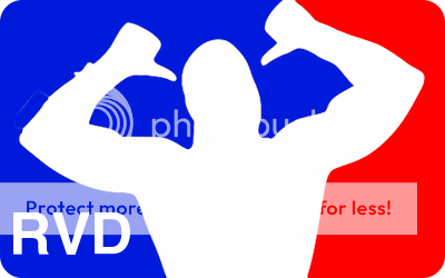
THOUGHTS: Same as the RKO one, but I don't like it as much.
There you have it. As usual, request your own ARLO sig. And if you want to wear one of these, just PM me. I'd love some rep too
bye now")
No announcements or anything, straight into sigs.
WINNING & LOSING
THOUGHTS: Made this after the atrocious Victory Road ending. Charlie Sheen's winning had been the shit for the last week and these 2 are spitting images of each other. There's nothing special about the sig itself.
HURRICANE
THOUGHTS: Been experimenting with cinematic borders. This one came off alright. To tell you the truth, I don't like this one. It's just... boring.
POPE
THOUGHTS: I've been trying to make a good Pope sig for AGES. I think I've finally pulled one off. Blue and black bg and then the rhs image. I gave it a black and blue gradient map and just left it at that. Then I added the lines on a new layer, and added his logo on top. Another new technique I've been using is making a gradient map of a pic and moving it below the original pic. Then I'd duplicate it and give each of them a motion blur in opposite directions. I'd then blur the edges of the original image. That's what I did here.
AJ STYLES
THOUGHTS: Another AJ sig. Defs one of my fave wrestlers of all time. His DVD recently got re-released over here so I bought it and was inspired. I like this sig, it hits your eyes nicely.
NBA RKO
THOUGHTS: This idea just hit me so I had to make it. Started with a blue BG then rounded the corners. I then added the image on a new layer and filled it white. Then on the bottom layer I simply selected roughly down the middle of the image and filled it red. Then I did a few searches trying to find out what font the NBA uses (It's Helvetica bold or something like it) and added the text.
NBA RVD
THOUGHTS: Same as the RKO one, but I don't like it as much.
There you have it. As usual, request your own ARLO sig. And if you want to wear one of these, just PM me. I'd love some rep too
bye now


 ARLO
ARLO 


